In the dashboard which I hacked together at MMC RTV Slovenia, I display a set of related flickr searches based on the current state of the system. So far, there’s a distinct lack of snakes, volcanoes, lava, fire, explosions and other things that might freak an engineer out as much as a server outage.
 Thoughts:
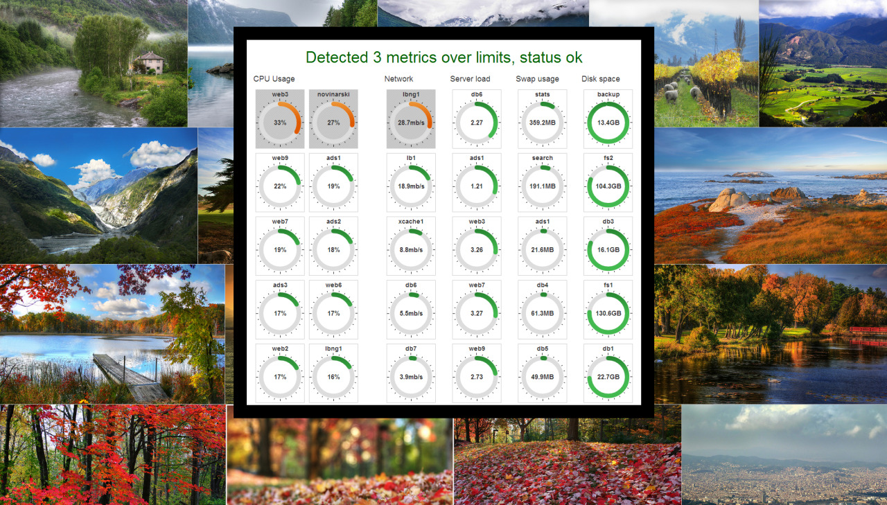
I like how the hosts are clearly marked when one of their metrics goes over a threshold. The CPU based hosts are on the left two columns, network is in the third, server load in the fourth. The right columns (disk and swap usage) are descriptive but only for a daily report, not so much for a live dashboard. I can clearly see the marked hosts across the room, even if I would miss the background.
Some metrics, especially API latency, really need to find their way onto the dashboard, replacing about half the indicators on it currently. I would really like to graph this in near real time (<5s), meaning some kind of partial updates, to graph this in 60 seconds and 5 minute intervals.
I’m feeding the data from Ganglia, which is about as real time as data comes from. The obvious issues are clearly visible on the dashboard, which is the point. Ganglia’s web front end, even if updated frequently, is only useful for short term historical data. Since I have the host/cluster data, a few selected graphs can be easily viewed by clicking on a specific hosts indicator.
From a design standpoint… it’s average. It’s half ubiquitous, and that’s the half I like. I should tweak the black border color to match the detected state, or maybe make the whole thing more “widget” like. Pay attention to spacing between indicators, readability of fonts,… Tweaking it, basically.
I like it. I need to test it on an iPad.
- Tit Petric
Thoughts:
I like how the hosts are clearly marked when one of their metrics goes over a threshold. The CPU based hosts are on the left two columns, network is in the third, server load in the fourth. The right columns (disk and swap usage) are descriptive but only for a daily report, not so much for a live dashboard. I can clearly see the marked hosts across the room, even if I would miss the background.
Some metrics, especially API latency, really need to find their way onto the dashboard, replacing about half the indicators on it currently. I would really like to graph this in near real time (<5s), meaning some kind of partial updates, to graph this in 60 seconds and 5 minute intervals.
I’m feeding the data from Ganglia, which is about as real time as data comes from. The obvious issues are clearly visible on the dashboard, which is the point. Ganglia’s web front end, even if updated frequently, is only useful for short term historical data. Since I have the host/cluster data, a few selected graphs can be easily viewed by clicking on a specific hosts indicator.
From a design standpoint… it’s average. It’s half ubiquitous, and that’s the half I like. I should tweak the black border color to match the detected state, or maybe make the whole thing more “widget” like. Pay attention to spacing between indicators, readability of fonts,… Tweaking it, basically.
I like it. I need to test it on an iPad.
- Tit Petric
